"Best marketing doesn't feel like marketing." – Tom Fishburne
The Click Effect: Why a Small CTA Can Be the Cause of or Kiss of Death for Your Email Campaign
Picture spending hours crafting the ideal email, yet getting terrible click-through rates. Guilty party? A poor CTA. A single little line — a button, a link, a sentence — can be the margin between silence and sales.
In this post, I'm going to dissect how to build email CTAs that don't simply sit pretty — they work. Whether you're emailing a newsletter, promotion, or product launch, your CTA is your closer.
What Is an Email CTA?
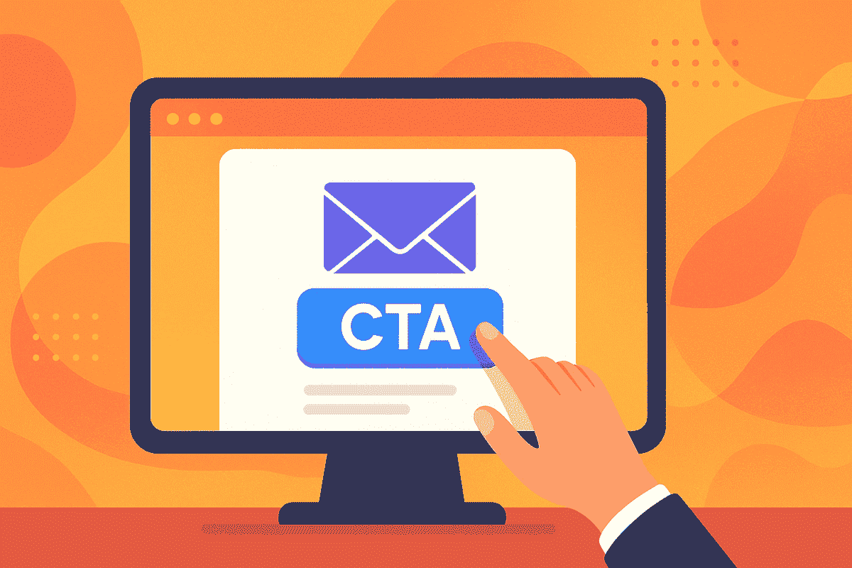
An email CTA, or Call-to-Action, is a call to action that directs readers to do something specific next. It's the nudge, push, or invitation to do something.
Examples:
"Shop Now"
"Download the Guide"
"Claim Your Discount"
"Book Your Free Demo"
It's not a button — it's the pulse of your email conversion strategy.
Why Email CTAs Are So Important for SMBs
For small businesses, every email sent is a chance to win — or lose — a customer. A compelling CTA can:
- Drive website traffic
- Boost sales and leads
- Drive event registrations
- Establish trust and brand authority
Without a distinct CTA, even the most compelling email has no purpose.
The 5 Golden Characteristics of a High-Converting CTA
Not every CTA is created equal. The best CTAs have these characteristics:
It's clear what happens if they click.
"Now," "Today," "Limited Offer" creates action.
What's in it for them?
It's standing out in the layout.
One action, one button.
Step-by-Step: How to Write a Killer Email CTA
Know Your Goal
Before writing, ask: What action do I want the reader to take?
Use Action Verbs
Begin with bold, action-oriented words:
Add Value
Connect your CTA with a benefit:
"Click here"
"Get My Free Checklist"
Create Urgency (Optional)
Include time-limited language:
Test and Refine
A/B test various CTAs. Small changes = big results.
CTA Placement: Where to Put It and Why It Matters
Above the Fold
Ideal for impatient readers
After Key Benefits
Works to build momentum
At the End
Ideal for narrative-driven emails
Pro Tip: Don't be shy to repeat the CTA if your email is lengthy. Repetition boosts response rates.
Words That Convert: CTA Copywriting Examples
| Weak CTA | Strong CTA |
|---|---|
| Learn More | Discover How It Works |
| Submit | Get Your Free Quote |
| Click Here | Begin Your Free Trial |
| Buy Now | Claim 25% Off Your First Order |
Make the benefit immediate and tangible.
Design Hacks to Get Your CTA Noticed
- Display a contrasting color button
- Insert white space around the CTA
- Make buttons responsive on mobile
- Display arrow icons or mild motion indicators
- Display font as bold and readable
A gorgeous CTA that's hidden or difficult to tap will destroy conversions.
Frequent Mistakes to Sidestep
- Too many CTAs in a single email
- Sloppy or generic copy
- Hidden buttons in text-dense emails
- Misleading copy (bait and switch)
- Too much use of "Click Here"
Real-Life CTA Examples That Aced It
Dropbox
CTA: "Find Your Plan"
Why it works: Personalized, soft-sell, invites exploration
Trello
CTA: "Sign Up – It's Free!"
Why it works: Zero friction, instant value
Casper
CTA: "See Why People Are Sleeping Better"
Why it works: Social proof and curiosity-driven
Turn Clicks Into Conversions
Designing the ideal email CTA is not about flashy buttons or hype — it's about clarity, value, and timing. If your email creates interest, your CTA is the doorway to results. Make it irresistible.
Next time you click send, pose the question:
"Would I click this?"
FAQs Regarding Email CTAs
Q1. How many CTAs should I put in an email?
Ideally, one. But in longer emails, it's fine to repeat the same CTA (not multiple ones).
Q2. What do I get — buttons or links?
Buttons tend to perform better, particularly on mobile.
Q3. How short/long should a CTA be?
Less than 6 words. Short, sharp, and clear is best.
Q4. Do I need to customize my CTAs?
Yes! "Start Your Plan, Alex" trumps "Start Now."
Q5. Can I put emojis in CTAs?
If branded, yes. Just test it first.

