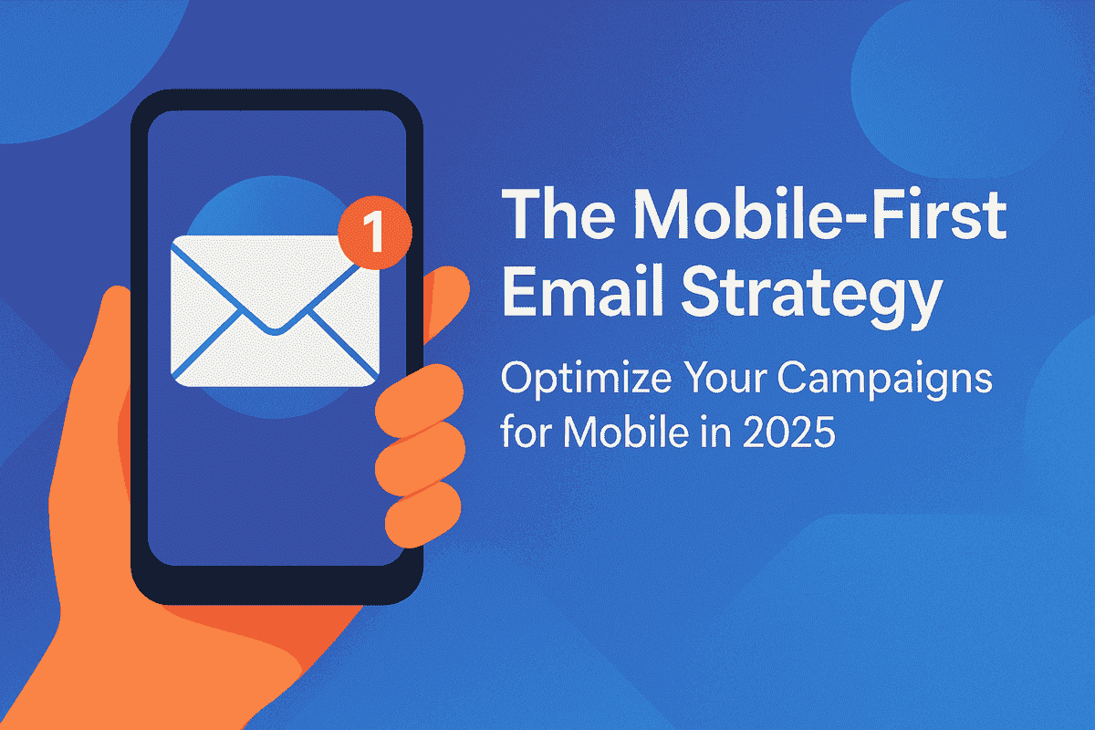
Are Your Emails Still Stuck in 2015?
Here's a surprising fact — over 81% of email opens now happen on mobile devices. That means if your email campaign isn't optimized for smartphones, you're likely losing engagement, clicks, and conversions.
In 2025, mobile-first isn't just an option. It's the standard.
As a small business owner or marketer, you don't need to have a tech team to make the transition to mobile. You just need the right strategy — and that's what this guide is for.
Why Mobile-First Email Marketing Matters in 2025
Mobile usage dictates all digital engagement in 2025. Here's why it matters for your email campaigns:
- 81% of emails opened on mobile
- Readers spend only 8 seconds or less scanning through emails
- Non-optimized emails bounce 70% more
Bottom line: If your email doesn't look pretty or load fast on mobile, you're being ignored.
Mobile vs Desktop Emails: What's the Difference?
You're a better creator when you know the difference. Here's why desktop and mobile emails are different:
| Feature | Desktop View | Mobile View |
|---|---|---|
| Screen Size | Wide, more real estate | Narrow, vertical scrolling |
| CTA Placement | Top/bottom, flexible | Must be thumb-accessible |
| Font Size | Standard (12–14px) | Must be larger (16–18px) |
| Load Speed | Less important | Important — mobile users bounce immediately |
| Layout Style | Multi-column | Single-column is the way to go |
7 Mobile-First Best Practices That You Need to Apply
Use Responsive Design
Ensure your template auto-adjusts to each screen size.
Select Single-Column Layouts
No pinching. No zooming. Just seamless scrolling.
Make CTAs Thumb-Friendly
Buttons have to be big enough and centered mid-screen.
Optimize Image Sizes
Compress images for rapid loading without sacrificing quality.
Use Short, Clear Subject Lines
30–40 characters max. Cut to the chase.
Write for Mobile
Split up content, use bullet points, and have short paragraphs.
Test on Actual Devices
Never preview. Always test on actual phones and tablets.
Step-by-Step: Designing a Mobile-Optimized Campaign
Let's walk step by step through designing a mobile-first email from scratch:
Start with a Responsive Template
Use mobile-friendly templates within your email platform (like Mailchimp or ConvertKit).
Craft a Mobile-Friendly Subject Line
Keep it short. Consider: "50% Off Today Only!" versus "We are giving you a 50% discount on special products for a limited time!"
Craft Short, Impactful Copy
Employ headings, white space, and bullet points to improve skimmability.
Include Mobile-Optimized Images
Keep email size in general under 100KB. Use WebP if available.
Design Large, Clickable Buttons
Don't use teeny text links. Use full-width CTA buttons such as "Shop Now."
Test on Devices + Inbox Preview
Render testing across Gmail, Apple Mail, Outlook, etc.
Mistakes to Avoid When Designing for Mobile
- Using multi-column layouts that break on phones
- Small font sizes that need zooming
- CTAs hidden at the bottom
- Forgetting about load times on mobile networks
- Overloading on images or GIFs
Pro Tip: If your email is loading in more than 3 seconds on 4G — you're losing readers.
Mobile Email Strategy Toolkit: The Tools You Need to Use
These tools make mobile optimization a breeze:
Litmus
Test on 90+ devices
Stripo
Mobile-responsive email editor
Moonsend
Automate campaigns with mobile-first functionality
Canva
Design beautiful email visuals with mobile presets
Email on Acid
Test render and speed on clients
FAQs on Mobile-First Email Marketing
How can I check whether my email is mobile-optimized?
Use Litmus or Email on Acid to test on real devices.
What is the font size for mobile email that I should target?
Target 16px body copy and 20–24px headlines for rapid readability.
Can mobile emails have videos?
You can, but use a thumbnail that links to a mobile-optimized landing page.
Don't I use images in mobile emails?
Not at all — just resize them and include alt text in case they don't load.
How do I increase mobile email click-through rates?
Place CTAs above the fold, leverage urgency, and make buttons large.
What's Next for Mobile Email in 2025?
Email marketing isn't dying — it's evolving. And mobile is its future.
If you want more engagement, better ROI, and stronger brand presence, your mobile-first strategy isn't just a best practice — it's a necessity.
Start with the simple steps above, test hard, and ever build for the screen your customer is really on.
Your customer is on a mobile. Now your email strategy should be, too.
